I want to try to do a before and after post, which I haven't attempted yet, in this baby blog of mine. So bear with me if it seems too long and boring. I'll try to rely on photos only, but I have to hunt them up. This is the last in in the series. For the whole story and detailed info, see posts 1-7 titled Porch Column Bases. The first in the series is
here. The latest in the series is
here. They're all tagged with the label "Replace Porch Column Base Series," which you can find along the right-hand side of the main blog page. So here goes ...
Two before shots of the whole porch:
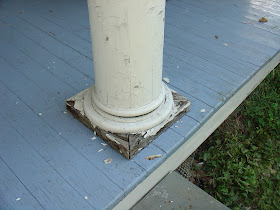
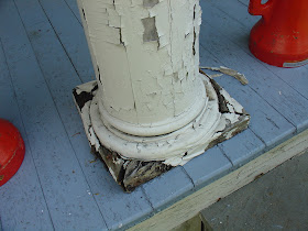
Then some close-ups of the four middle column bases we replaced.
Column Two Before:
Column Two After:

Column Three Before:

Column Three After:
Column Four Before:

Column Four After:
And Column Five Before -- the worst one:

Column Five After, hard to believe:
And last, a few after shots of the whole porch:


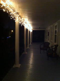
And very last, all lit up for the holidays!


The bases seem to have turned out great. That gap in the base gave it an “elevated” look, which is really nice. Glad you were able to find fillers for those wood gouges. The lighting was a nice touch. What are you planning to light it up with after the holidays?
ReplyDeleteAngelina Garcia
Angelina - Thanks so much for your comment. I like the way they look perched up on feet, too. It's cleaner. In the summer, I usually have some hurricanes out there with candles, which makes a nice place to sit in the evenings. I'd love to have a porch swing ... someday!
ReplyDeleteLove this....so pretty.Now it looks new and great.
ReplyDeleteColumns
Darla - Thank you!
DeleteThe color of the porch floor is a nice touch. Since it isn’t visible from afar, the porch maintains that white look, but when you’re actually there it adds a contrast to the whole white setting.
ReplyDeleteThat is quite an effort to replace the base of those columns, but from the looks of it they really needed it. Good choice of design, too.
Tittle Brothers